Saturday, December 18, 2010

As Promised

And now for something completely different: How to make plain yogurt into Greek-style yogurt.

  1. Set a colander in a large mixing bowl. Be sure to use a strainer large enough to hold the amount of yogurt you'll be spooning into it.
  2. Line the colander with a clean tea towel, cheesecloth, or paper towels.
  3. Spoon the plain yogurt into the lined colander, then place in the refrigerator for at least two hours.
  4. Check the yogurt for desired thickness. If the yogurt isn't thick enough, leave it in the fridge for another hour. If the yogurt is too thick, stir some of the clear liquid left in the mixing bowl (the whey from the plain yogurt) back in.
  5. Enjoy your delicious and economical Greek-style yogurt.


1. 2.  
3. 4.
Photos from of EHow.com.

Friday, December 17, 2010

Photoshop Done Right

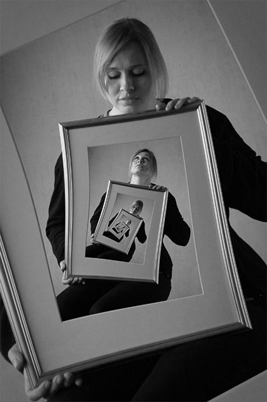
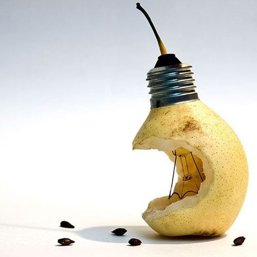
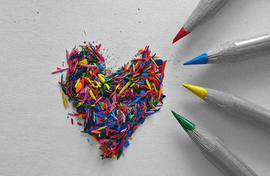
Designers often abuse the powers of Photoshop, as we've seen. With all the airbrushed photographs on newsstands these days, it's easy to forget that Photoshop was created to design innovative and cutting-edge images.

This week, Graphic Design Blog showcased "40 Fresh and Extraordinary Photoshop Manipulations." Not only do the manipulations exhibit amazing design talent, but also show all that Photoshop is capable of. Here are few of the designs:


Which is your favorite?

Wednesday, December 15, 2010

Graph Jam

Graph Jam was created by the Cheezburger Network and its content is described as, "Life and pop culture graphed for your inner geek." Like the network's other famous websites like Fail Blog and The Daily What, Graph Jam definitely makes people laugh. The site turns everyday situations into cheesy 3-D pie charts.

Here are some recent favorites:


Be sure to check out Graph Jam for more laughs.

Tuesday, December 14, 2010

One Sentence Movie Review


Dances with Wolves
"It's hard to believe Kevin Costner actually made something this good."

An Ode to the End of the Semester

Ah, Jessie Spano. She stood out as Saved by the Bell's token neurotic, always wanting As and trying too hard to get them. In one infamous episode (Jessie's Song), Ms. Spano took things too far and became addicted to caffeine pills.


Lucky for her, recovery arrived before the end credits, as shown in the following infographic:


The stresses of school get to all of us, but try not to stress yourselves out. Hang in there, fellow students. It will be over soon enough.

Sunday, December 12, 2010

Concept Gone Very Wrong

Duncan Hines launched an advertising campaign for the its new Amazing Glazes. Driven by the tagline "Make your desserts sing," the company took things one step too far with the product's first commercial and created something racially offensive: Hip Hop Cupcakes.


The commercial was pulled from YouTube, however you can watch the original video here. It's astounding that an advertisement like this actually reached the public, like no one at Duncan Hines stopped to think what it could mean to people. Hip Hop Cupcakes definitely serves as a reminder to always consider how different audiences will perceive your work.

Friday, December 10, 2010

Show and Tell: Zeitgeist 2010: Year in Review

Google released a movie yesterday showcasing the top searches of 2010. The short film brings attention to the year's major events like the earthquake in Haiti and the first face transplant, wonderfully summarizing a year's worth of events in 3 minutes.


Thursday, December 9, 2010

More Fun With Photoshop

It's now expected that magazine cover girls are airbrushed in Photoshop to look younger and thinner, but when does retouching in Photoshop go too far?

Jezebel recently posted an image of actress Megan Fox and exposed all of the changes that were made to the photograph in Photoshop before it hit magazine stands. Before gracing the pages of InStyle, the young beauty's eye color, skin tone, pores, veins, chin and hair were altered.


Apparently, celebrities don't even meet magazines' standards these days.

Disc Cover Disaster

What in the sparkle motion is this?


Though the album was released some time ago, I finally caught a glimpse of it up close today at Starbucks. For a portrait album cover, there is way too much going on here. The pose, the colors and the "glitter" almost invoke Barbie packaging.


It is by far one of the worst album designs I've seen in a long time.

Monday, December 6, 2010

United States of Autocomplete

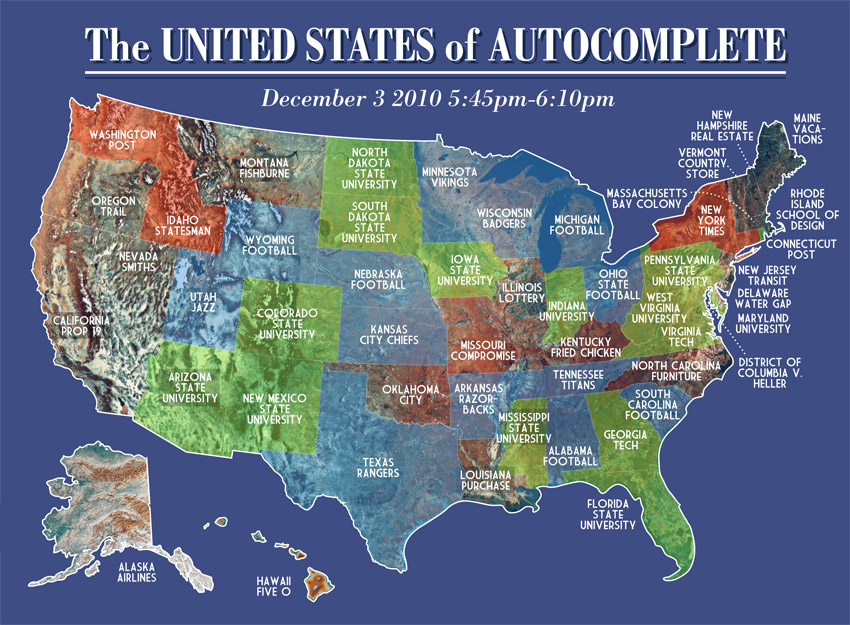
Very Small Array posted an infographic today of each state's primary association, according to Google's autocomplete feature. Sports, universities and newspapers proved to be the most common things people look up about a given state, however there were some interesting outliers such as "Montana Fishburne," "North Carolina furniture," and "Vermont country store."


It is somewhat surprising that only two states resulted in anything related to leisure or travel. "Hawaii hotels" seems like it would be a much more enjoyable Google search than "Hawaii Five-O."

Friday, December 3, 2010

Show and Tell: Short Video

Target Women appeared regularly on Current TV. Sarah Haskins hosted the show that imitated a news brief, but parodied advertisements aimed at women. Episodes of the show targeted a variety of trends and products including jewelry, chocolate, and razors. Check out the famous Target Women: Yogurt Edition:


Current TV no longer produces new episodes of Target Women, however you can watch and enjoy them all here

One Sentence Movie Reviews

It was brought to my attention recently that several close friends have a knack for reviewing movies. Not the sort of reviews you're probably used to that strive to articulate every aspect of a film, but reviews that cleverly (and sometimes cattily) summarize a movie in a single sentence.

One Sentence Movie Review will become a regular feature on bold-faced, however here are a few favorites to get you started:


Pirates of the Caribbean: Dead Man's Chest
"This movie is a CGI sh-tstorm."


The Runaways
"This movie should be called 'Joan Jett the Stable Rock and Cherie Curie the Basketcase.'"


Elf
"I think the pitch for this movie was: Will Ferrell... In an elf costume."

Wednesday, December 1, 2010

Lottery of Life

Save the Children recently unveiled a new ad campaign in the United Kingdom. The Lottery of Life uses the simple technique of compare and contrast, however with such powerful images this campaign is anything but simple.


It's clear that the images were very carefully selected. The photographs on the left side of each advertisement show poor living conditions and get the point of the ad across without being too overwhelming or depressing.

What do you think?

Wednesday, November 24, 2010

A Book and a Work of Art

Author Jonathan Safran Foer has taken book design to a new level. For his latest work "Tree of Codes," Foer adapted his favorite book by cutting out words and pages to create a new story. Words peek through windows of the cutout pages, making the written work a piece of structural art.


Foer explained what led him to this unique idea in an interview with The New York Times. "I was more interested in subtracting than adding, and also in creating a book with a three-dimensional life. On the brink of the end of paper, I was attracted to the idea of a book that can’t forget it has a body," he said. The author also compared his cutting of the original novel to carving a stone. His favorite book offered endless possibilities for a new story, but he was also dependent on the word choices of another author.

Though "Tree of Codes" adapted another writer's work, it certainly has something new to offer readers everywhere.

Tuesday, November 23, 2010

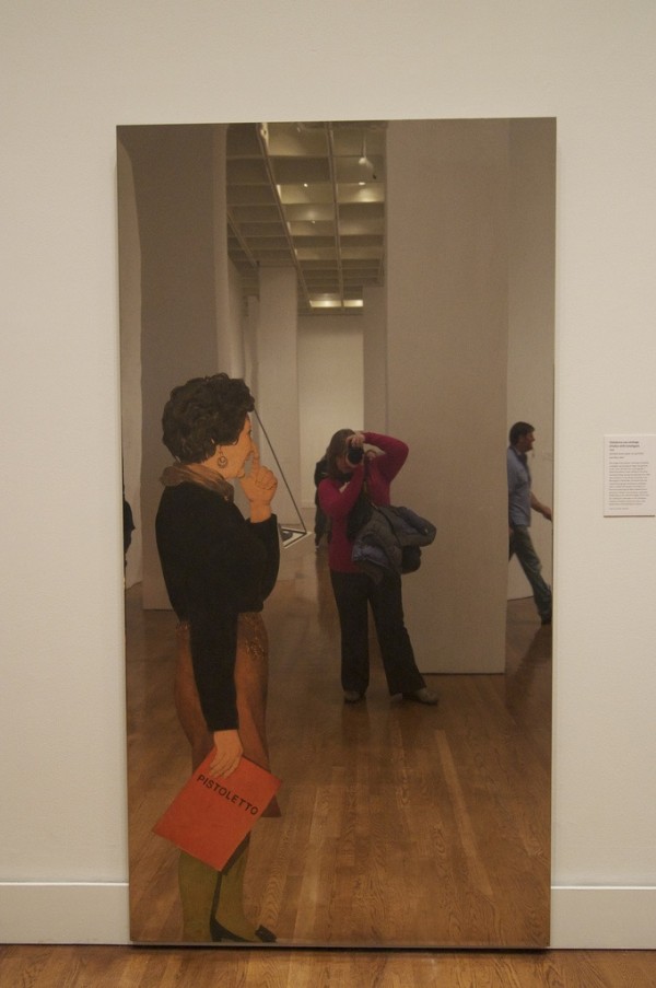
Michelangelo Pistoletto

The Philadelphia Museum of Art is currently exhibiting the work of Michaelangelo Pistoletto. Pistoletto gained fame in the 1960s and 1970s for sculptural works (like Venus of the Rags) and screen-prints on mirrors and shined steel. By placing the screen-prints on mirrors or shined steel, the artist allows the viewer and the work's surroundings to become part of the work itself. According to the Guggenheim Collection, Pistoletto's work "intended both to integrate the environment and the viewer into his work and to question the nature of reality and representation."

Here are some examples of the artist's work and how viewers can interact with the pieces:


Friday, November 19, 2010

Show and Tell: Infographics

Warning: This information graphic may cause a headache.


There is way too much going on in this graphic. The graphic uses an unnecessary amount of images, presents too much information, and immediately makes the reader want to move on. Even the "How to Read the Data" chart is confusing.

Whereas this Colours in Cultures graphic shows a great deal of information cleanly and simply. The chart requires a second look, yet is easy to understand.


Thursday, November 18, 2010

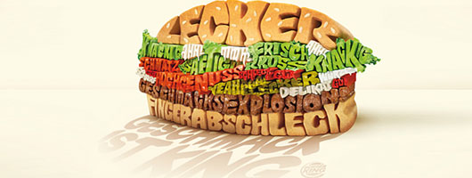
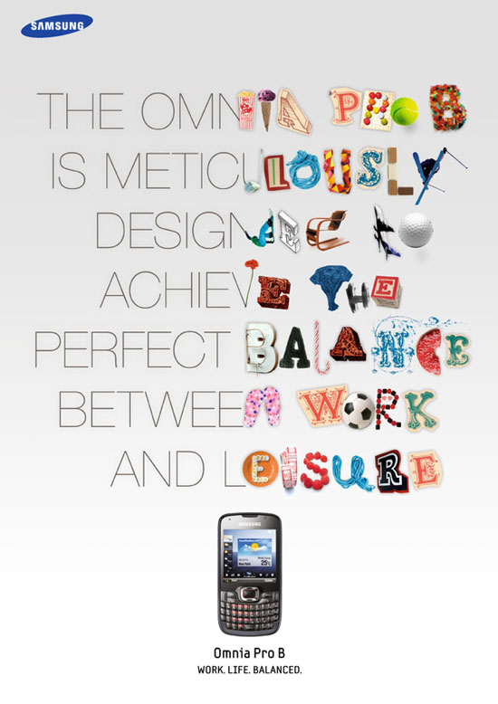
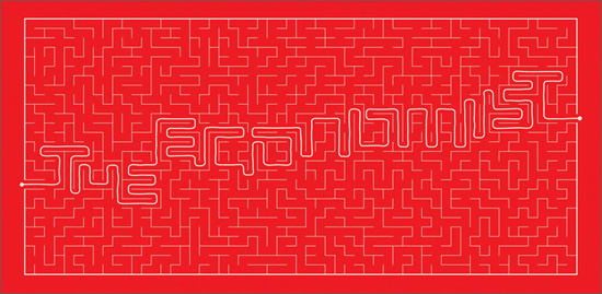
Cool Typography Print Ads

Graphic Design Blog recently shared 22 amazing typography prints ads. The blog says, "Although a picture is worth a thousand words, but the power of words cannot be underestimated." The following ads certainly don't underestimate the power of words and wonderfully illustrate how effective typography can be.


Typography isn't the only thing that makes these ads unique. Each show a clever concept in a simple and visually appealing way. Be sure to check out the other typography print ads that made the cut here

Wednesday, November 17, 2010

Top Words of 2010

The Global Language Monitor announced this week the most used words of 2010. The organization uses a mathematical formula to track the frequency of words, phrases and names used by English speakers.

Without further ado, here are the top 10 words of 2010:

1. Spillcam
2. Vuvuzela
3. The Narrative
4. Refudiate
5. Guido and Guidette
6. Deficit
7. Snowmagedden (and ‘Snowpocalypse’)
8. 3-D
9. Shellacking
10. Simplexity

David Letterman responded to the year's top words with his own list, Top Ten New Words of 2010. Check it out:


To see the top 10 phrases and names of 2010, visit the Global Language Monitor.

Saturday, November 13, 2010

Show and Tell: Packaging

Though not exactly a package and not exactly a narrative, Julien Berthier's boat definitely has a story to tell. The sailor describes his one-of-a-kind boat as a "permanent and mobile image of a wrecked ship that has become a functional and safe leisure object."

Made from a boat that was cut in half, Berthier's boat was given a new keel to keep it upright and a motor to make it mobile. See it in action:


Love Love from julien berthier on Vimeo.


For a more traditional example of a package redesign, check out "Nice Package" from October 29.

Friday, November 12, 2010

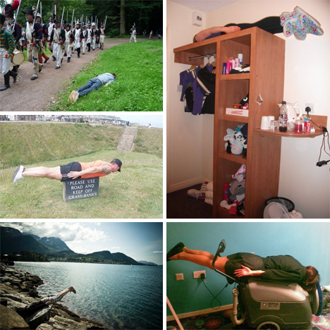
The Lying Down Game

"Parkour... For those who can't be arsed." That's how Brits Gary Clarkson and Christian Langdon describe their creation The Lying Down Game. The rules of The Lying Down Game are easy:

1) The more public the better. 2) The more people involved the better. Please be aware that the palms of your hands must be flat against your side and the tips of your toes pointing at the ground. Just as if you were standing, but vertically challenged. FACE DOWN!


Photographs from The Lying Down Game are definitely amusing to look at for obvious reasons, but as Web Urbanist points out there are less obvious reasons too. The site says, "Seen separately, these photos suggest thousands of weird people all willing to do something a little crazy. But taken together, the photos of people all around the world lying face down in odd locations looks a lot like collective performance art."

Though contributing to a collective art project is intriguing, having fun looks like the main reason to play the game. Either way, my brain is already pondering the best places in the neighborhood to play The Lying Down Game. What about you?