Wednesday, November 24, 2010

A Book and a Work of Art

Author Jonathan Safran Foer has taken book design to a new level. For his latest work "Tree of Codes," Foer adapted his favorite book by cutting out words and pages to create a new story. Words peek through windows of the cutout pages, making the written work a piece of structural art.


Foer explained what led him to this unique idea in an interview with The New York Times. "I was more interested in subtracting than adding, and also in creating a book with a three-dimensional life. On the brink of the end of paper, I was attracted to the idea of a book that can’t forget it has a body," he said. The author also compared his cutting of the original novel to carving a stone. His favorite book offered endless possibilities for a new story, but he was also dependent on the word choices of another author.

Though "Tree of Codes" adapted another writer's work, it certainly has something new to offer readers everywhere.

Tuesday, November 23, 2010

Michelangelo Pistoletto

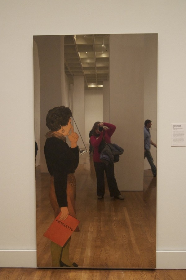
The Philadelphia Museum of Art is currently exhibiting the work of Michaelangelo Pistoletto. Pistoletto gained fame in the 1960s and 1970s for sculptural works (like Venus of the Rags) and screen-prints on mirrors and shined steel. By placing the screen-prints on mirrors or shined steel, the artist allows the viewer and the work's surroundings to become part of the work itself. According to the Guggenheim Collection, Pistoletto's work "intended both to integrate the environment and the viewer into his work and to question the nature of reality and representation."

Here are some examples of the artist's work and how viewers can interact with the pieces:


Friday, November 19, 2010

Show and Tell: Infographics

Warning: This information graphic may cause a headache.


There is way too much going on in this graphic. The graphic uses an unnecessary amount of images, presents too much information, and immediately makes the reader want to move on. Even the "How to Read the Data" chart is confusing.

Whereas this Colours in Cultures graphic shows a great deal of information cleanly and simply. The chart requires a second look, yet is easy to understand.


Thursday, November 18, 2010

Cool Typography Print Ads

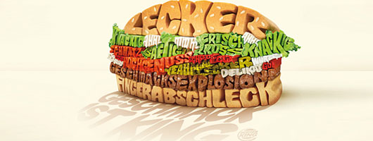
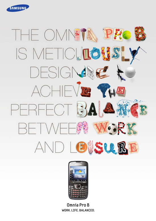
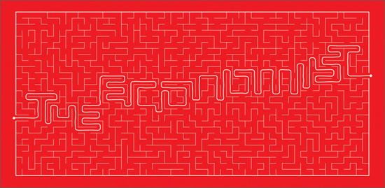
Graphic Design Blog recently shared 22 amazing typography prints ads. The blog says, "Although a picture is worth a thousand words, but the power of words cannot be underestimated." The following ads certainly don't underestimate the power of words and wonderfully illustrate how effective typography can be.


Typography isn't the only thing that makes these ads unique. Each show a clever concept in a simple and visually appealing way. Be sure to check out the other typography print ads that made the cut here

Wednesday, November 17, 2010

Top Words of 2010

The Global Language Monitor announced this week the most used words of 2010. The organization uses a mathematical formula to track the frequency of words, phrases and names used by English speakers.

Without further ado, here are the top 10 words of 2010:

1. Spillcam
2. Vuvuzela
3. The Narrative
4. Refudiate
5. Guido and Guidette
6. Deficit
7. Snowmagedden (and ‘Snowpocalypse’)
8. 3-D
9. Shellacking
10. Simplexity

David Letterman responded to the year's top words with his own list, Top Ten New Words of 2010. Check it out:


To see the top 10 phrases and names of 2010, visit the Global Language Monitor.